Daily UI Challenge: Day 1–5
To hone my UI Design skills and practice rapid prototyping, I’ve taken on the Daily UI Challenge. Every day I am presented with something new to design, such as an app, icon, or interaction. While doing these designs I also like to give myself constraints or additional challenges to develop my skills further.
This is an ongoing project and will be updated regularly.
During the first 5 days of this challenge, I was very new to Figma. My goal with the daily challenges wasn’t just to improve my UI skills, but also my familiarity with the software. Looking back on this work, it’s exciting to see how my skills in UI advance over time, and how UX design thinking is steadily introduced more heavily into the work.
Day 1
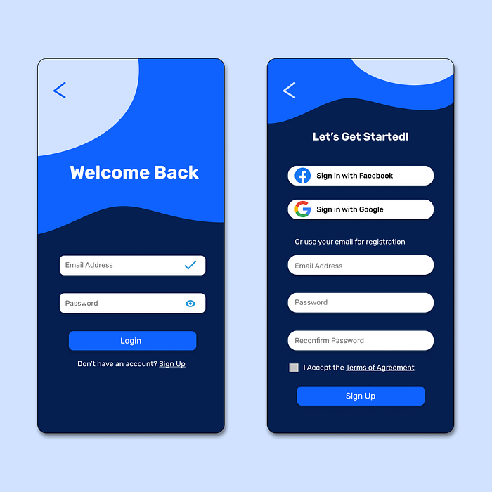
Task: Create a Signup Page

Day 1 of this challenge represents one of my first attempts at using Figma. I wanted to use this challenge as an opportunity to practice basic visual design and prototyping in the software.
I also decided to create a login page. The colours were chosen to give a cool, inviting look to the app, with slightly aquatic tones and shapes.
Day 2
Task: Design a Credit Card Payment Screen

I approached this screen with the idea that users may want a clear visualization of the card they’re selecting. To do this, I added a slider with renderings of each credit card, along with the option to add more.
Day 3
Task: Create a Landing Page

For this challenge, I wanted to limit myself to use an achromatic palette. Removing the colour forced me to pay even closer attention to contrast, gradients, and shadows.
Day 4
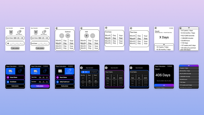
Task: Design a Calculator
For this challenge, I wanted to do something more interesting than a standard calculator. I frequently use a date calculator to quickly find the amount of time between two dates and thought it would be interesting to create a version of this with a sleek new UI. To experiment with new platforms, I also chose to design and prototype the app for the Apple Watch.

Designing for the Apple Watch introduced some interesting constraints. The screen space is very tiny, which limits the amount of information that can be displayed at a given time. Additionally, the screen is too small to allow for comfortable typing. After trying several Apple Watch apps, I realized the most practical method for data entry would be scrolling dropdowns.
Day 5
Task: Create an App Icon

Illustrating is something I was very new to at this point, so this challenge felt daunting initially. However, I was also excited to push outside my comfort zone. For the theme, I used a random idea generator, which suggested an app for an Optometry Organization.

I started out by designing an eyeball. At first, I designed a realistic eyeball but felt the design looked dated. I then removed the colours and fill to create an eye outline. This was more modern but was harder to read when shrunk down onto a phone screen. Finally, I reintroduced the fill but left the iris colour out, producing the cleanest, most legible result.
Thank you for reading! To see more, including my UX/Product design work, visit my Product Design portfolio here.
Also see: Daily UI Challenge Days 6–10
